Анимация иконки гамбургер
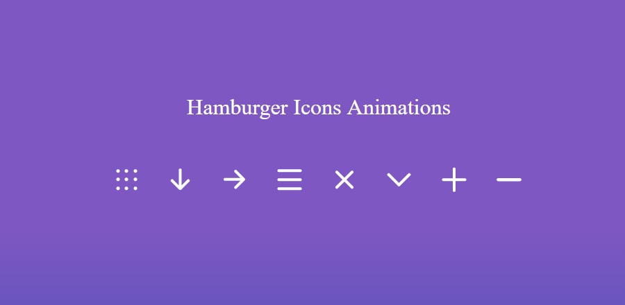
Небольшая подборка эффектов для иконки «бутерброд», ну или «гамбургер», кому как больше нравится.
В нашем примере будет 8 иконок, каждая со своим эффектом.
Значит сначала давайте определимся со структурой
<div class="icon nav-icon-1">
	<span></span>
	<span></span>
	<span></span>
	<span></span>
	<span></span>
	<span></span>
	<span></span>
	<span></span>
	<span></span>
</div>
<div class="icon nav-icon-2">
	<span></span>
	<span></span>
	<span></span>
</div>
<div class="icon nav-icon-3">
	<span></span>
	<span></span>
	<span></span>
</div>
<div class="icon nav-icon-4">
	<span></span>
	<span></span>
	<span></span>
</div>
<div class="icon nav-icon-5">
	<span></span>
	<span></span>
	<span></span>
</div>
<div class="icon nav-icon-6">
	<span></span>
	<span></span>
	<span></span>
</div>
<div class="icon nav-icon-7">
	<span></span>
	<span></span>
	<span></span>
</div>
<div class="icon nav-icon-8">
	<span></span>
	<span></span>
	<span></span>
</div>
Каждая иконка отмечена своим порядковым классом nav-icon-1 …2, …3 и тд.
Теперь разберём стили.
Иконка 1:
/* nav-icon-1 */
.nav-icon-1 {
	width: 30px;
	height: 30px;
	position: relative;
	transition: .1s;
	margin: 10px;
	cursor: pointer;
	display: inline-block;
}
.nav-icon-1 span {
	width: 5px;
	height: 5px;
	background-color: #fff;
	display: block;
	border-radius: 50%;
	position: absolute;
}
.nav-icon-1:hover span {
	transform: scale(1.2);
	transition: 350ms cubic-bezier(.8, .5, .2, 1.4);
}
.nav-icon-1 span:nth-child(1) {
	left: 0;
	top: 0;
}
.nav-icon-1 span:nth-child(2) {
	left: 12px;
	top: 0;
}
.nav-icon-1 span:nth-child(3) {
	right: 0;
	top: 0;
}
.nav-icon-1 span:nth-child(4) {
	left: 0;
	top: 12px;
}
.nav-icon-1 span:nth-child(5) {
	position: absolute;
	left: 12px;
	top: 12px;
}
.nav-icon-1 span:nth-child(6) {
	right: 0px;
	top: 12px;
}
.nav-icon-1 span:nth-child(7) {
	left: 0;
	bottom: 0;
}
.nav-icon-1 span:nth-child(8) {
	position: absolute;
	left: 12px;
	bottom: 0;
}
.nav-icon-1 span:nth-child(9) {
	right: 0;
	bottom: 0;
}
.nav-icon-1.open {
	transform: rotate(180deg);
	cursor: pointer;
	transition: .2s cubic-bezier(.8, .5, .2, 1.4);
}
.nav-icon-1.open span{
	border-radius: 50%;
	transition-delay: 200ms;
	transition: .5s cubic-bezier(.8, .5, .2, 1.4);
}
.nav-icon-1.open span:nth-child(2) {
	left: 6px;
	top: 6px;
}
.nav-icon-1.open span:nth-child(4) {
	left: 6px;
	top: 18px;
}
.nav-icon-1.open span:nth-child(6) {
	right: 6px;
	top: 6px;
}
.nav-icon-1.open span:nth-child(8) {
	left: 18px;
	bottom: 6px;
}
Иконка 2:
/* nav-icon-2 */
.nav-icon-2 {
	width: 35px;
	height: 30px;
	margin: 10px;
	position: relative;
	cursor: pointer;
	display: inline-block;
}
.nav-icon-2 span {
	background-color: #FFF;
	position: absolute;
	border-radius: 2px;
	transition: .3s cubic-bezier(.8, .5, .2, 1.4);
}
.nav-icon-2 span:nth-child(1) {
	width: 100%;
	height: 4px;
	display: block;
	top: 0;
	left: 0;
}
.nav-icon-2 span:nth-child(2) {
	width: 100%;
	height: 4px;
	display: block;
	top: 13px;
	left: 0;
}
.nav-icon-2 span:nth-child(3) {
	width: 100%;
	height: 4px;
	display: block;
	bottom: 0;
	left: 0;
}
.nav-icon-2:not(.open):hover span:nth-child(1) {
	width: 100%;
	height:  4px;
	display: block;
	top: -2px;
	left: 0;
	transition: .3s cubic-bezier(.8, .5, .2, 1.4);
}
.nav-icon-2:not(.open):hover span:nth-child(2) {
	width: 100%;
	height: 4px;
	display: block;
	top: 13px;
	left: 0;
	transition: .4s cubic-bezier(.8, .5, .2, 1.4);
}
.nav-icon-2:not(.open):hover span:nth-child(3) {
	width: 100%;
	height: 4px;
	display: block;
	bottom: -2px;
	left: 0;
	transition: .3s cubic-bezier(.8, .5, .2, 1.4);
}
.nav-icon-2.open span:nth-child(1) {
	left: 3px;
	top: 12px;
	width: 30px;
	transition: .3s cubic-bezier(.8, .5, .2, 1.4);
	transform: rotate(90deg);
	transition-delay: 150ms;
}
.nav-icon-2.open span:nth-child(2) {
	left:2px;
	top: 20px;
	width: 20px;
	transition: .3s cubic-bezier(.8, .5, .2, 1.4);
	transform: rotate(45deg);
	transition-delay: 50ms;
}
.nav-icon-2.open span:nth-child(3) {
	left: 14px;
	top: 20px;
	width: 20px;
	transition: .3s cubic-bezier(.8, .5, .2, 1.4);
	transform: rotate(-45deg);
	transition-delay: 100ms;
}
Иконка 3:
/* nav-icon-3 */
.nav-icon-3 {
	width: 35px;
	height: 30px;
	margin: 10px;
	position: relative;
	cursor: pointer;
	display: inline-block;
}
.nav-icon-3 span {
	background-color: #FFF;
	position: absolute;
	border-radius: 2px;
	transition: .3s cubic-bezier(.8, .5, .2, 1.4);
}
.nav-icon-3 span:nth-child(1) {
	width: 100%;
	height: 4px;
	display: block;
	top: 0;
	left: 0;
}
.nav-icon-3 span:nth-child(2) {
	width: 100%;
	height: 4px;
	display: block;
	top: 13px;
	left: 0;
}
.nav-icon-3 span:nth-child(3) {
	width: 100%;
	height: 4px;
	display: block;
	bottom: 0;
	left: 0;
}
.nav-icon-3:not(.open):hover span:nth-child(1) {
	width: 100%;
	height: 4px;
	display: block;
	top: -2px;
	left: 0;
	transition: .3s cubic-bezier(.8, .5, .2, 1.4);
}
.nav-icon-3:not(.open):hover span:nth-child(2) {
	width: 100%;
	height: 4px;
	display: block;
	top: 13px;
	left: 0;
	transition: .4s cubic-bezier(.8, .5, .2, 1.4);
}
.nav-icon-3:not(.open):hover span:nth-child(3) {
	width: 100%;
	height: 4px;
	display: block;
	bottom: -2px;
	left: 0;
	transition: .3s cubic-bezier(.8, .5, .2, 1.4);
}
.nav-icon-3.open {
	transform: rotate(-90deg);
}
.nav-icon-3.open  span:nth-child(1) {
	left: 3px;
	top: 12px;
	width: 30px;
	transition: .3s cubic-bezier(.8, .5, .2, 1.4);
	transform: rotate(90deg);
	transition-delay: 150ms;
}
.nav-icon-3.open  span:nth-child(2) {
	left:2px;
	top: 20px;
	width: 20px;
	transition: .3s cubic-bezier(.8, .5, .2, 1.4);
	transform: rotate(45deg);
	transition-delay: 50ms;
}
.nav-icon-3.open  span:nth-child(3) {
	left: 14px;
	top: 20px;
	width: 20px;
	transition: .3s cubic-bezier(.8, .5, .2, 1.4);
	transform: rotate(-45deg);
	transition-delay: 100ms;
}
Иконка 4:
/* nav-icon-4 */
.nav-icon-4 {
	width: 35px;
	height: 30px;
	margin: 10px;
	position: relative;
	cursor: pointer;
	display: inline-block;
}
.nav-icon-4 span {
	background-color: #FFF;
	position: absolute;
	border-radius: 2px;
	transition: .3s cubic-bezier(.8, .5, .2, 1.4);
}
.nav-icon-4 span:nth-child(1) {
	width: 100%;
	height: 4px;
	display: block;
	top: 0;
	left: 0;
}
.nav-icon-4 span:nth-child(2) {
	width: 100%;
	height: 4px;
	display: block;
	top: 13px;
	left: 0;
}
.nav-icon-4 span:nth-child(3) {
	width: 100%;
	height: 4px;
	display: block;
	bottom: 0;
	left: 0;
}
.nav-icon-4:not(.open):hover span:nth-child(1) {
	width: 100%;
	height: 4px;
	display: block;
	top: -2px;
	left: 0;
	transition: .3s cubic-bezier(.8, .5, .2, 1.4);
}
.nav-icon-4:not(.open):hover span:nth-child(2) {
	width: 100%;
	height: 4px;
	display: block;
	top: 13px;
	left: 0;
	transition: .4s cubic-bezier(.8, .5, .2, 1.4);
}
.nav-icon-4:not(.open):hover span:nth-child(3) {
	width: 100%;
	height: 4px;
	display: block;
	bottom: -2px;
	left: 0;
	transition: .3s cubic-bezier(.8, .5, .2, 1.4);
}
.nav-icon-4.open {
	transform: rotate(90deg);
}
.nav-icon-4.open span:nth-child(1) {
	left: 3px;
	top: 12px;
	width: 30px;
	transition: .3s cubic-bezier(.8, .5, .2, 1.4);
	transform: rotate(90deg);
	transition-delay: 150ms;
}
.nav-icon-4.open span:nth-child(2) {
	left:2px;
	top: 20px;
	width: 20px;
	transition: .3s cubic-bezier(.8, .5, .2, 1.4);
	transform: rotate(45deg);
	transition-delay: 50ms;
}
.nav-icon-4.open span:nth-child(3) {
	left: 14px;
	top: 20px;
	width: 20px;
	transition: .3s cubic-bezier(.8, .5, .2, 1.4);
	transform: rotate(-45deg);
	transition-delay: 100ms;
}
Иконка 5:
/* nav-icon-5 */
.nav-icon-5 {
	width: 35px;
	height: 30px;
	margin: 10px;
	position: relative;
	cursor: pointer;
	display: inline-block;
}
.nav-icon-5 span {
	background-color: #fff;
	position: absolute;
	border-radius: 2px;
	transition: .3s cubic-bezier(.8, .5, .2, 1.4);
	width: 100%;
	height: 4px;
	transition-duration: 500ms
}
.nav-icon-5 span:nth-child(1) {
	top: 0;
	left: 0;
}
.nav-icon-5 span:nth-child(2) {
	top: 13px;
	left: 0;
	opacity: 1;
}
.nav-icon-5 span:nth-child(3) {
	bottom: 0;
	left: 0;
}
.nav-icon-5:not(.open):hover span:nth-child(1) {
	transform: rotate(-3deg) scaleY(1.1);
}
.nav-icon-5:not(.open):hover span:nth-child(2) {
	transform: rotate(3deg) scaleY(1.1);
}
.nav-icon-5:not(.open):hover span:nth-child(3) {
	transform: rotate(-4deg) scaleY(1.1);
}
.nav-icon-5.open span:nth-child(1 ){
	transform: rotate(45deg);
	top: 13px;
}
.nav-icon-5.open span:nth-child(2) {
	opacity: 0;
}
.nav-icon-5.open span:nth-child(3) {
	transform: rotate(-45deg);
	top: 13px;
}
Иконка 6:
/* nav-icon-6 */
.nav-icon-6 {
	width: 35px;
	height: 30px;
	margin: 10px;
	position: relative;
	cursor: pointer;
	display: inline-block;
}
.nav-icon-6 span {
	background-color: #fff;
	position: absolute;
	border-radius: 2px;
	transition: .3s cubic-bezier(.8, .5, .2, 1.4);
	width: 100%;
	height: 4px;
}
.nav-icon-6 span:nth-child(1) {
	top: 0;
	left: 0;
}
.nav-icon-6 span:nth-child(2) {
	top: 13px;
	left: 0;
}
.nav-icon-6 span:nth-child(3) {
	bottom: 0;
	left: 0;
}
.nav-icon-6:not(.open):hover span:nth-child(1) {
	transform: scaleY(1.2);
	left: -5px;
}
.nav-icon-6:not(.open):hover span:nth-child(2) {
	transform: rotate(5deg) scaleY(1.1);
}
.nav-icon-6:not(.open):hover span:nth-child(3) {
	transform: scaleY(1.2);
	left: 5px;
}
.nav-icon-6.open span:nth-child(1) {
	transform: rotate(45deg) scaleX(0.7);
	top: 13px;
	left: -8px;
}
.nav-icon-6.open span:nth-child(2) {
	transform: scale(0);
	transition-duration: 50ms
}
.nav-icon-6.open span:nth-child(3) {
	transform: rotate(-45deg) scaleX(0.7);
	top: 13px;
	left: 7px;
}
Иконка 7:
/* nav-icon-7 */
.nav-icon-7 {
	width: 35px;
	height: 30px;
	margin: 10px;
	position: relative;
	cursor: pointer;
	display: inline-block;
}
.nav-icon-7 span {
	background-color: #FFF;
	position: absolute;
	border-radius: 2px;
	transition: .3s cubic-bezier(.8, .5, .2, 1.4);
	width: 100%;
	height: 4px;
}
.nav-icon-7 span:nth-child(1) {
	top: 0;
	left: 0;
}
.nav-icon-7 span:nth-child(2) {
	top: 13px;
	left: 0;
}
.nav-icon-7 span:nth-child(3) {
	bottom: 0;
	left: 0;
}
.nav-icon-7:not(.open):hover span:nth-child(1) {
	transform: scaleX(.8);
}
.nav-icon-7:not(.open):hover span:nth-child(2) {
	transform: scaleX(.5);
}
.nav-icon-7:not(.open):hover span:nth-child(3) {
	transform: scaleX(.8);
}
.nav-icon-7.open span:nth-child(1) {
	transform: rotate(90deg);
	top: 13px;
}
.nav-icon-7.open span:nth-child(2) {
	transform: scale(0);
	transition-duration: 50ms
}
.nav-icon-7.open span:nth-child(3) {
	top: 13px;
}
Иконка 8:
/* nav-icon-8 */
.nav-icon-8 {
	width: 35px;
	height: 30px;
	margin: 10px;
	position: relative;
	cursor: pointer;
	display: inline-block;
}
.nav-icon-8 span {
	background-color: #FFF;
	position: absolute;
	border-radius: 2px;
	transition: .3s cubic-bezier(.8, .5, .2, 1.4);
	width: 100%;
	height: 4px;
}
.nav-icon-8 span:nth-child(1) {
	top: 0;
	left: 0;
}
.nav-icon-8 span:nth-child(2) {
	top: 13px;
	left: 0;
}
.nav-icon-8 span:nth-child(3) {
	bottom: 0;
	left: 0;
}
.nav-icon-8:not(.open):hover span:nth-child(1) {
	transform: scaleX(.8);
}
.nav-icon-8:not(.open):hover span:nth-child(2) {
	transform: scaleX(.5);
}
.nav-icon-8:not(.open):hover span:nth-child(3) {
	transform: scaleX(.8);
}
.nav-icon-8.open span:nth-child(1) {
	top: 13px;
}
.nav-icon-8.open span:nth-child(2) {
	top: 13px;
}
.nav-icon-8.open span:nth-child(3) {
	top: 13px;
}
Со стилями закончили. Осталось прикрутить скрипт, чтобы добавлялся класс при клике по иконке.
<script>
const icons = document.querySelectorAll('.icon');
icons.forEach (icon => {
	icon.addEventListener('click', (event) => {
		icon.classList.toggle("open");
	});
});
</script>